kamuiarikado
Loyal Familiar
 [TI0] Elitist Gatekeeper
Posts: 111

inherit
1956
0
May 8, 2020 8:13:04 GMT -6
102
kamuiarikado
[TI0] Elitist Gatekeeper
111
Aug 24, 2017 15:04:49 GMT -6
August 2017
kamuiarikado
|
Post by kamuiarikado on Jul 7, 2018 13:52:43 GMT -6
I prefer gameplay over graphics; if the game have ugly graphics, but the gameplay it's pretty good, have great control, creative level design and an awesome OST, then it's a good game. But if the game have great graphics and shallow gameplay, generic OST, bad controls and uninspired level design then it's a bad game forever.
|
|
inherit
2729
0
Jul 27, 2020 20:04:43 GMT -6
24
Starsmith
38
Jun 29, 2018 16:27:55 GMT -6
June 2018
starsmith
|
Post by Starsmith on Jul 7, 2018 15:20:24 GMT -6
1. They have consistently shown far superior graphics in their updates. And they said nothing and then gave us a downgraded version. That's... yeah, it might be an honest mistake, but ... it's still something of a violation of backer trust.
I am someone who backed very late, on the last day slacker backer was available, in fact! Hadn't heard of it before that!
What convinced me to do so, and to do so at $60, were three things: 1. New Metroidvania in the style of Symphony of the Night by IGA (yes plz forever I need this in my life), 2. As demonstrated in multiple videos on the Kickstarter that proved point 1 was the real deal, and 3. Backer exclusives.
What I saw on the Kickstarter dev updates and videos was not what I, personally, would consider "far superior graphics". Different, yes. Better in some places, yes. Worse in some places, also yes.
My trust is not violated in the slightest at this point. The demo is about exactly what I expected graphically, based on the videos I saw on the Kickstarter. I expected a beta/demo that was mostly in place but still needed a spit shine in spots and that's what I got. I didn't expect them to tell me everything that isn't finished or is being worked on or is experimental or not finalized either, because it's right there in the label.
Possibly I would feel differently if I'd backed earlier, I don't know. But I figured it was worth my $0.02 since it was the Kickstarter videos that sold me.
|
|
Torabi
New Blood
 [TI0]
[TI0]
Posts: 29
inherit
1216
0
Jul 11, 2022 23:06:58 GMT -6
21
Torabi
[TI0]
29
Mar 5, 2016 6:00:41 GMT -6
March 2016
torabi
|
Post by Torabi on Jul 7, 2018 18:51:04 GMT -6
Having read through the entire thread, I'm confused by all the speculation that the graphical changes are due to supporting less powerful platforms. I think it more likely that it's an attempt to address concerns about accessibility, about people not being able to tell where they can go, what they can stand on, what they can interact with, etc. There's been a general trend throughout the game's development of sacrificing atmosphere in exchange for clarity, and I think that's unfortunate. Consider the "shadow" when Miriam passes behind an object, to make it clear where she is, or the bright outline on the crate you need to push, or the cannon you need to light. They've created a long-term problem of the game looking bland in order to flatten the introductory curve. Everything is really too bright and glossy, and there's not enough variation in color. The only room with any atmosphere is the red-lit room with the moon. Everything else feels kind of generic and similar to each other, because the lighting is so flat.
|
|
inherit
7
0
Jun 28, 2019 21:35:13 GMT -6
1,291
CastleDan
1,514
May 28, 2015 9:50:13 GMT -6
May 2015
castledan
|
Post by CastleDan on Jul 7, 2018 21:46:54 GMT -6
I agree with ya Nezuto. As much as I would like the graphics to be polished in this game, particularly the character models, I'd have to say that's probably the lowest priority for me. The thing about graphics is while indeed they should have lower priority, the game still has to look pleasant to the eyes. Accomplishing this doesn't require the latest graphical technology and techniques, just good art direction. I, just as you, grew up playing what we call now "old games", though in my case it was Super Nintendo, not the 8bit console. And I can say with confidence that if I boot up Castlevania Dracula X (yes, the bad Rondo of Blood port) or Super Mario World right now, the first thought that will cross my mind when the game starts will be "Well, for a 5th generation game, this doesn't look bad at all, in fact it's good!" and why's that? Because those games have good art direction, something that unfortunately the demo lacks heavily. The problem with 3D graphics is that when it is badly done, it can look extremely generic and unpleasant to look at. Changing that involves clever usage of lightning, textures, colors and materials. Lightning, for example, is something the backers have been pointing out since early 2017, when the development updates with areas made by the new team were being rolled out. Lack of environment detail, bad usage of colors (or the lack of), all of them are things that we all have been complaining since the very early stages of development, yet we got a demo that looks worse despite our feedback. That's why we are worried. Yes I agree that gameplay is top priority, there is no good game out there that has bad gameplay and good graphics, the opposite being true however. But even still, when we already know that gameplay-wise and music-wise Bloodstained is in good hands, the next thing we should focus our attention is the art direction, because right now the game looks generic with extreme lack of polishment, save for the character models. This post is 100% how I feel about the demo. It sums up everything i've said from the beginning....the gray, the lack of truly unique rooms throughout....all these things look so much worse in 3D. It might pass in 2D but it makes 3D look super generic. If the environments how the attention to detail/color/shader look of the models we wouldn't be having an issue right now visually i'd suspect. 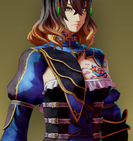 The model has everything I want the environments to be but aren't. The 3D model itself almost looks 2D due to the shader. The shader gives it a very drawn look to it as opposed to very bland textures it looks painted and very cel shaded. There's loads of color in her model, and it pops. All the things I wish the environments accomplished. |
|
anonthemouse
Loyal Familiar
 [TI2]What lies in wait behind the walls?
Posts: 161
inherit
1770
0
Jun 28, 2023 2:03:14 GMT -6
149
anonthemouse
[TI2]What lies in wait behind the walls?
161
Dec 7, 2016 4:34:32 GMT -6
December 2016
anonthemouse
|
Post by anonthemouse on Jul 8, 2018 3:13:29 GMT -6
There are some things I think are improved, like the side textures on the stairs. In other areas, though, it does seem like the older textures were more detailed an...I struggle for a word, but "gritty" might be closest. Also, the current lighting is very bright and open, while the older shots are more dark and moody. Oddly, one of the things that stands out the most to me is that I miss that "fatter" health bar. I don't mind the colour change to mana, but I think making the HP bar thinner actually de-emphasizes it. I'd rather have the thicker bar to make lower health more noticeable.
|
|
Angel-Corlux
505 Games
Official Staff
What is a man? A miserable little pile of secrets!
Posts: 253
Staff Mini-Profile Theme: WIP

inherit
505 Games
1927
0
1
Dec 3, 2019 13:05:57 GMT -6
965
Angel-Corlux
What is a man? A miserable little pile of secrets!
253
Jul 26, 2017 10:59:55 GMT -6
July 2017
angel
Staff Mini-Profile Theme: WIP
|
Post by Angel-Corlux on Jul 9, 2018 12:30:33 GMT -6
Hello everyone, I just wanted to give you all a brief update on this, this has been a very busy time as you can all imagine, but thanks to the help of my awesome producer, Iga and the team are fully aware of the feedback on this and we are discussing / working with them on this. We've used almost every visual asset the community provided regarding this feedback, and even created some of our own. While I can't yet give you details of course of the results of our conversations and work being done, I wanted you all to know that we're not ignoring this.
|
|
purifyweirdshard
Administrator
Administrator  Calling from Heaven
Posts: 3,789
Staff Mini-Profile Theme: Example 2

inherit
Administrator
210
0
1
Oct 25, 2024 0:03:05 GMT -6
3,660
purifyweirdshard
Calling from Heaven
3,789
Jun 29, 2015 7:24:38 GMT -6
June 2015
purifyweirdsoul
Staff Mini-Profile Theme: Example 2
|
Post by purifyweirdshard on Jul 9, 2018 13:05:04 GMT -6
I hope it doesn't scare them into doing anything too drastic and setting them back on what they've worked on so far. I think minor adjustments would probably cut it, mostly like:
Improvement of color (dev update 8 village video vs current, entrance greys), but reduction in brightness and glossiness (castle in general, shiny effect on objects)
Moodier/foggier atmosphere with appropriate shadows as seen in some shots
The return/presence of procedural generation
Adjustment of character model appearance in menu and dialogue, to match cut scene Miriam's (which we have determined relates to in-engine mipmapping adjustments, a distance-based texel modification that can be adjusted)
I think those are the main things. Easier said than done and perhaps not altogether "minor", but me and many of the rest of us are just under the impression that some of these things are already planned/in there and were just disabled or not used for the demo for some reason.
|
|
ReySol
Master of the Solar Eclipse
Ancient Legion  [TI0]
[TI0]
Posts: 350

inherit
Master of the Solar Eclipse
11
0
Jul 2, 2024 13:03:13 GMT -6
315
ReySol
[TI0]
350
May 28, 2015 11:06:46 GMT -6
May 2015
mark
|
Post by ReySol on Jul 9, 2018 14:38:43 GMT -6
Angel, your answer is much appreciated. I have a feeling these things, such as color, lighting, contrast, ambience etc. can be adjusted to give the game that more gothic, atmospheric feel and more vibrant colours/visuals.
|
|
Yän
Herald of the Moon
Loyal Familiar

Posts: 476

inherit
Herald of the Moon
1316
0
Jan 2, 2022 8:01:36 GMT -6
415
Yän
476
Jun 12, 2016 6:59:44 GMT -6
June 2016
yaen
|
Post by Yän on Jul 9, 2018 16:11:57 GMT -6
Angel-Corlux Thank you for the post. It's reassuring to read that these things are being discussed in detail.
|
|
dareka
Dhampyr
Loyal Familiar

Posts: 345

inherit
Dhampyr
1332
0
Mar 8, 2023 13:21:18 GMT -6
724
dareka
345
Jun 17, 2016 16:09:16 GMT -6
June 2016
dareka
|
Post by dareka on Jul 9, 2018 16:23:17 GMT -6
Hello everyone, I just wanted to give you all a brief update on this, this has been a very busy time as you can all imagine, but thanks to the help of my awesome producer, Iga and the team are fully aware of the feedback on this and we are discussing / working with them on this. We've used almost every visual asset the community provided regarding this feedback, and even created some of our own. While I can't yet give you details of course of the results of our conversations and work being done, I wanted you all to know that we're not ignoring this. Thank you so much for the update, Angel-Corlux . Knowing that our observations are being discussed is very reassuring! I hope it doesn't scare them into doing anything too drastic and setting them back on what they've worked on so far. I think minor adjustments would probably cut it, mostly like: Improvement of color (dev update 8 village video vs current, entrance greys), but reduction in brightness and glossiness (castle in general, shiny effect on objects) Moodier/foggier atmosphere with appropriate shadows as seen in some shots The return/presence of procedural generation Adjustment of character model appearance in menu and dialogue, to match cut scene Miriam's (which we have determined relates to in-engine mipmapping adjustments, a distance-based texel modification that can be adjusted) I think those are the main things. Easier said than done and perhaps not altogether "minor", but me and many of the rest of us are just under the impression that some of these things are already planned/in there and were just disabled or not used for the demo for some reason. Yes...basically there are three issues here: 1. The art direction for the castle and village segments. 2. Higher-detail textures and procedurally generated elements like the ones we saw in the preview builds 3. Improved texture detail for the character models Two of these issues also relate to improved lighting, as much of it appears to have been baked into the textures or produced through alpha-blending with lighting textures. Point number 2 is the biggest issue for me. I guess how "minor" these changes are depends on what the reason was for them being dropped from the demo build in the first place. If they didn't make the rest of the assets at the same quality, then it's pretty major - in some aspects, possibly insurmountable, even. If they eliminated them temporarily to make adjustments to the engine and/or to optimize them, then the only thing to be done is review the art direction and increase the number/resolution of the mip maps; reviewing the art direction could perhaps be rather costly. Regardless, I'm still hopeful. |
|
Nezuto
Master Alchemist
 Welcome to my world....
Posts: 662
inherit
238
0
Jun 18, 2024 3:35:49 GMT -6
510
Nezuto
Welcome to my world....
662
Jul 8, 2015 12:18:42 GMT -6
July 2015
nezuto
|
Post by Nezuto on Jul 9, 2018 16:31:29 GMT -6
Don't overwork yourselves over it, though. All this feedback just means we really care about this project, as well. I think this will help alleviate some of the tension that's been mounting as of late.
|
|
RichterB
Loyal Familiar
 [TI1]
[TI1]
Posts: 338

inherit
971
0
Dec 13, 2015 1:34:36 GMT -6
282
RichterB
[TI1]
338
Dec 13, 2015 0:48:59 GMT -6
December 2015
richterb
|
Post by RichterB on Jul 9, 2018 18:17:49 GMT -6
Yes...basically there are three issues here: 1. The art direction for the castle and village segments. 2. Higher-detail textures and procedurally generated elements like the ones we saw in the preview builds 3. Improved texture detail for the character models Two of these issues also relate to improved lighting, as much of it appears to have been baked into the textures or produced through alpha-blending with lighting textures. Point number 2 is the biggest issue for me. I guess how "minor" these changes are depends on what the reason was for them being dropped from the demo build in the first place. If they didn't make the rest of the assets at the same quality, then it's pretty major - in some aspects, possibly insurmountable, even. If they eliminated them temporarily to make adjustments to the engine and/or to optimize them, then the only thing to be done is review the art direction and increase the number/resolution of the mip maps; reviewing the art direction could perhaps be rather costly. Regardless, I'm still hopeful. You summarized this well. Regarding the procedurally generated stuff, that does have some rather major implications to it. Jogur posted this in the feedback thread:  imgur.com/U1yDdmX imgur.com/U1yDdmX With the Garden of Silence, I eventually expect/anticipate more lush "garden" spaces, and presenting that greenery will probably be noticeably helped by procedural generation, if possible.
Angel-Corlux , thank you for the update. It is very comforting. Though, as has been said, A LOT is going good with the game. I appreciate yours and the team's work. |
|
inherit
2747
0
Jul 12, 2018 8:14:10 GMT -6
0
h00dz
2
Jun 30, 2018 6:12:10 GMT -6
June 2018
h00dz
|
Post by h00dz on Jul 10, 2018 7:05:26 GMT -6
Hello everyone, I just wanted to give you all a brief update on this, this has been a very busy time as you can all imagine, but thanks to the help of my awesome producer, Iga and the team are fully aware of the feedback on this and we are discussing / working with them on this. We've used almost every visual asset the community provided regarding this feedback, and even created some of our own. While I can't yet give you details of course of the results of our conversations and work being done, I wanted you all to know that we're not ignoring this. Thanks for this Angel-Corlux , while this issue caused my first post on this forum. I'm really happy that it has been not only acknowledged but addressed by the publisher and teams involved. Something a lot of publishers would never do. I look forward to here more information as it comes available. +1 Internets to you. |
|
inherit
7
0
Jun 28, 2019 21:35:13 GMT -6
1,291
CastleDan
1,514
May 28, 2015 9:50:13 GMT -6
May 2015
castledan
|
Post by CastleDan on Jul 10, 2018 8:07:40 GMT -6
Very interested to see what will come of this visually. I remember the first time when fans were very critical of the games look when they showed off this - 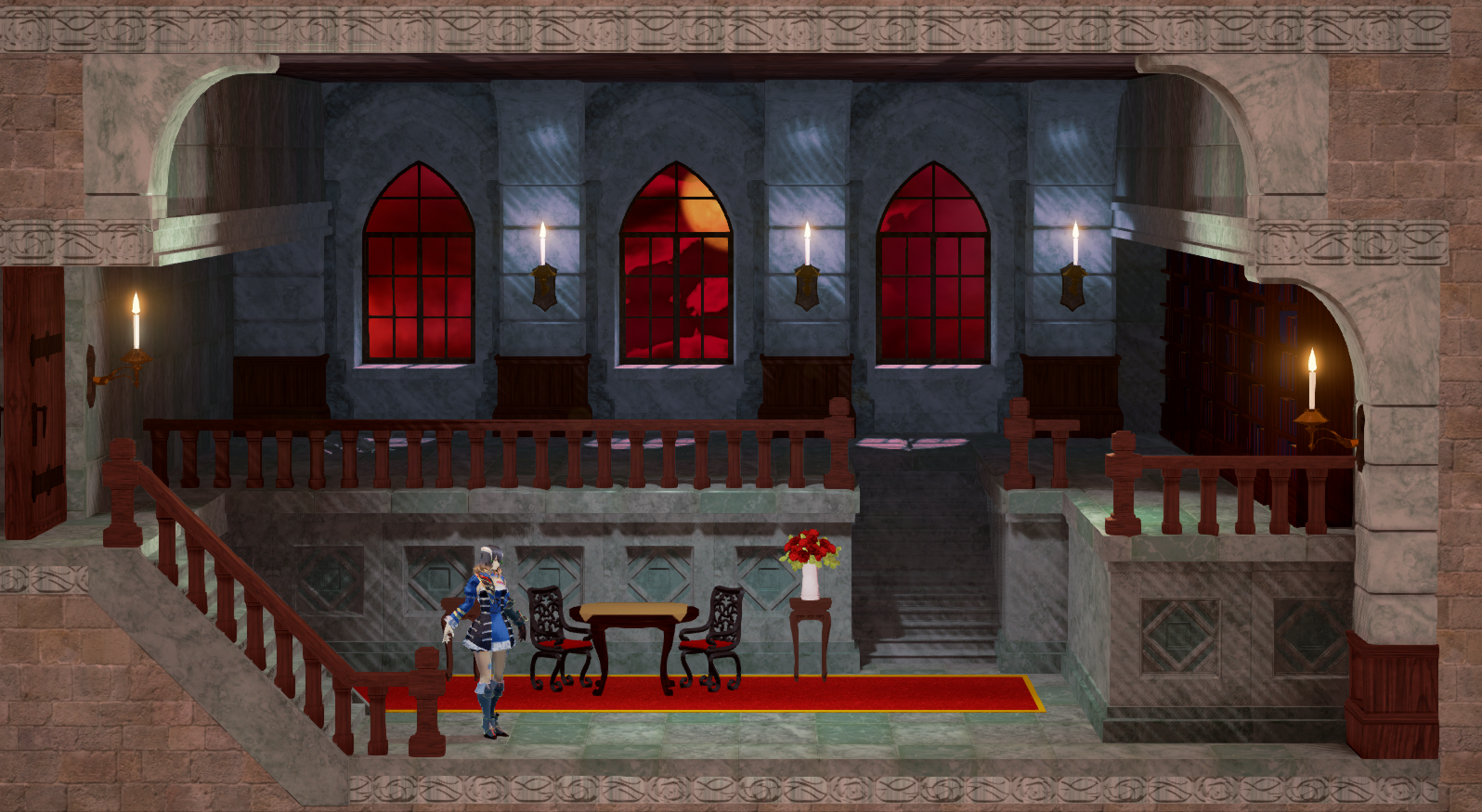 and then the next time we saw it they gave us this instead 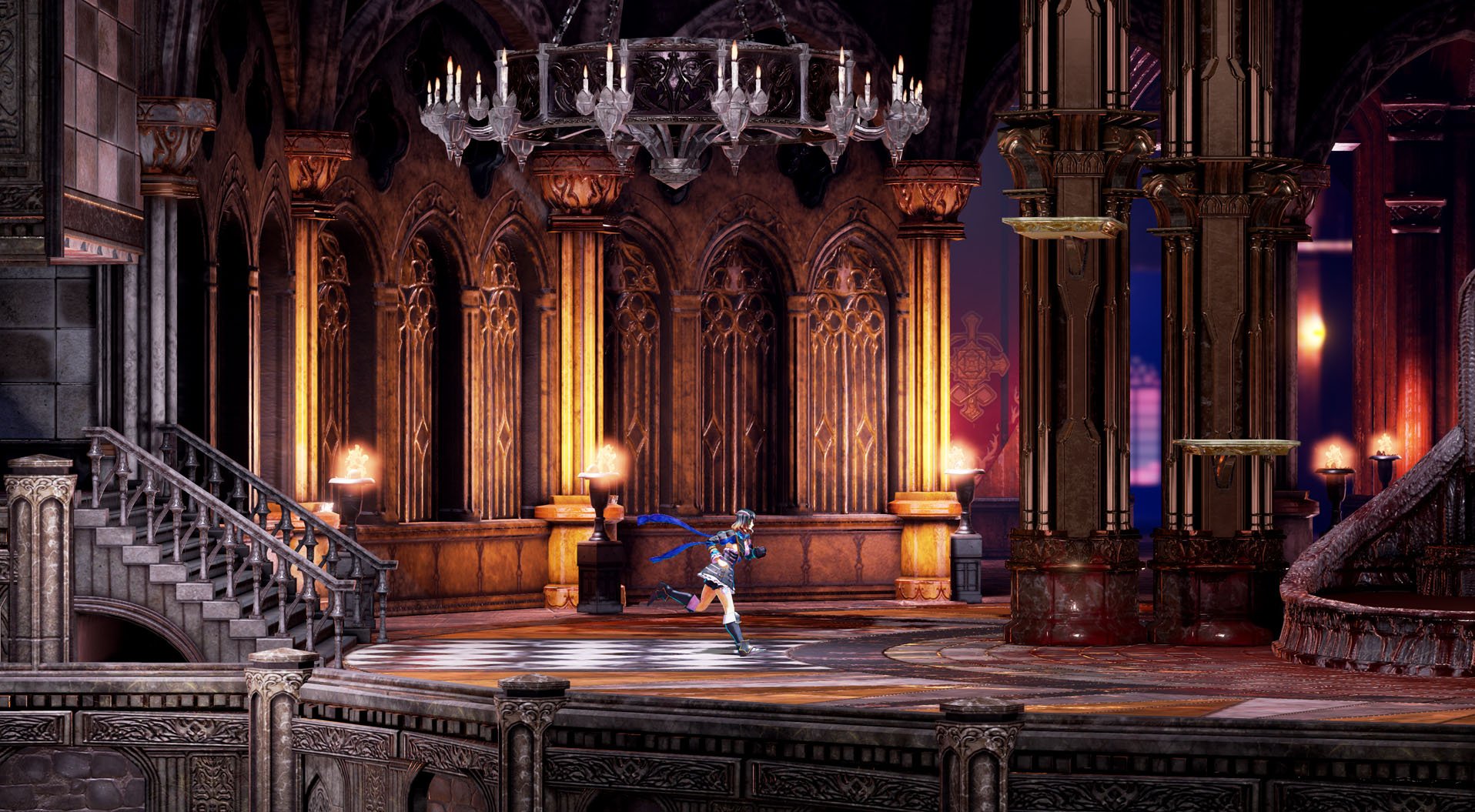 It's tough to be critical over something you actually do really enjoy but sometimes it has great benefits. |
|
RichterB
Loyal Familiar
 [TI1]
[TI1]
Posts: 338

inherit
971
0
Dec 13, 2015 1:34:36 GMT -6
282
RichterB
[TI1]
338
Dec 13, 2015 0:48:59 GMT -6
December 2015
richterb
|
Post by RichterB on Jul 10, 2018 15:20:51 GMT -6
Very interested to see what will come of this visually. I remember the first time when fans were very critical of the games look when they showed off this -  and then the next time we saw it they gave us this instead  It's tough to be critical over something you actually do really enjoy but sometimes it has great benefits. Yeah, that was incredible. I remember submitting this quick and rough mock-up I had an associate of mine do during the feedback period of that first image. (It was based on the assets given, but the interesting moonlight stream effect is something that would be cool to see in the future). I mentioned this in the feedback thread, but I hope we'll still get some blowing curtains from open windows eventually, too. Though, right now, there are bigger matters to settle. |
|
dareka
Dhampyr
Loyal Familiar

Posts: 345

inherit
Dhampyr
1332
0
Mar 8, 2023 13:21:18 GMT -6
724
dareka
345
Jun 17, 2016 16:09:16 GMT -6
June 2016
dareka
|
Post by dareka on Jul 10, 2018 15:40:03 GMT -6
I hope we'll still get some blowing curtains from open windows eventually, too. Though, right now, there are bigger matters to settle. I second that. Curtains are one of the things that give the most ambiance, that contribute the most to the mood, and they're completely static at this point. That, and Miriam's hair. But yes, there are bigger fish to fry, at the moment. |
|
inherit
2835
0
Jul 12, 2018 14:53:30 GMT -6
0
balobam
2
Jul 12, 2018 6:54:56 GMT -6
July 2018
balobam
|
Post by balobam on Jul 12, 2018 14:51:57 GMT -6
I think one of the bigger things to note is the shadows, or lack thereof for the most part. For a large creepy castle, or the burnt up village preceding it, it's very well lit, and not necessarily from the in-game light points - it makes things look almost too shiny? Too stand-out, perhaps? This is an awful screenshot, but it's from Lord of Shadows, but look at how everything is still clearly visible in terms of what's an enemy/background object, but there's a sort of looming fog a bit further back, and nothing looks too alive... I'm not sure if that conveys the point well, and the game does genuinely look fantastic from a purely technical standpoint, but there are a few visual points throughout in general that sort of reduce the overall 'gloomy' aesthetic, even if I can't quite put my finger on it. |
|
inherit
7
0
Jun 28, 2019 21:35:13 GMT -6
1,291
CastleDan
1,514
May 28, 2015 9:50:13 GMT -6
May 2015
castledan
|
Post by CastleDan on Jul 14, 2018 21:15:16 GMT -6
I'm not sure if that conveys the point well, and the game does genuinely look fantastic from a purely technical standpoint, but there are a few visual points throughout in general that sort of reduce the overall 'gloomy' aesthetic, even if I can't quite put my finger on it. I’m not saying I want the game to look like Mirror of fate, the fact that I wish Bloodstained had more of the model shader for the backgrounds should make that clear. I was just saying in this pic you can see a castle environments that still utilizes color to give it more flavor. There’s plenty in there that utilizes some color compared to the castle entrance in bloodstained that has a severe lack of it |
|
purifyweirdshard
Administrator
Administrator  Calling from Heaven
Posts: 3,789
Staff Mini-Profile Theme: Example 2

inherit
Administrator
210
0
1
Oct 25, 2024 0:03:05 GMT -6
3,660
purifyweirdshard
Calling from Heaven
3,789
Jun 29, 2015 7:24:38 GMT -6
June 2015
purifyweirdsoul
Staff Mini-Profile Theme: Example 2
|
Post by purifyweirdshard on Jul 15, 2018 20:31:39 GMT -6
Miriam's not the only one that looks better in cutscenes. Took some screenshots (for scientific purposes only ofc).   Compared of course to this, which doesn't look quite as good.  |
|
purifyweirdshard
Administrator
Administrator  Calling from Heaven
Posts: 3,789
Staff Mini-Profile Theme: Example 2

inherit
Administrator
210
0
1
Oct 25, 2024 0:03:05 GMT -6
3,660
purifyweirdshard
Calling from Heaven
3,789
Jun 29, 2015 7:24:38 GMT -6
June 2015
purifyweirdsoul
Staff Mini-Profile Theme: Example 2
|
Post by purifyweirdshard on Aug 1, 2018 13:11:03 GMT -6
While I do enjoy my Dominique post having been the most recent one for some time, I thought this was an important follow-up and addition to the thread and points, as well as dareka's recent post in the update thread. Update 71Question Angel-Corlux " Finally, regarding some of the comparisons of current and past graphical quality, while much of that is due to shaders and lighting work not being fully implemented into the demo, we are aware of your feedback and will be keeping a special focus on making sure the graphical quality is as high as possible. We are anxious to report on fixes and improvements we make, so please look forward to it." This was the most important thing that needed to be addressed, so I'd like to thank the staff for their efforts. I became pretty convinced that this was the case mid-way through the graphics downgrade feedback thread, but not everybody seemed totally convinced, and there remained the possibility of the downgrade being permanent, so it's great to have official confirmation. Anyway, I'm sure you guys have lots on your plate right now, so hang in there and good luck! |
|