JeffCross
Shadow of the Night
Ancient Legion  [TI0] Die monster!!!!!!
Posts: 1,365

inherit
Shadow of the Night
46
0
Aug 2, 2019 16:52:01 GMT -6
711
JeffCross
[TI0] Die monster!!!!!!
1,365
Jun 9, 2015 16:58:57 GMT -6
June 2015
jeffcross773
|
Post by JeffCross on May 8, 2017 10:21:47 GMT -6
Ok, first, hey peoples... I have been gone for awhile (zelda botw... nuff said, right?). Anyways, when I heard about the nintendo switch being cartridge based I was hoping to get physical copies of all my games... but alas, it was not meant to be  there are a lot of developers who are opting to release digital only games. So I thought, even if I buy the digital release I wanted to have a physical representation of my purchase. So I created a few box art mock-ups and will be posting them here... hope you guys enjoy them XD the first one is Wonder Boy III: the Dragon's Trap... I made this one reversible. This is the front cover 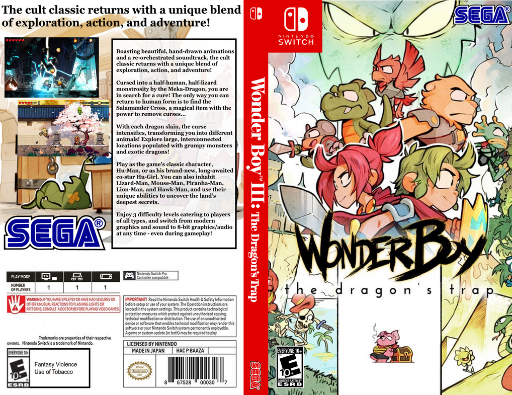 and this is the inside 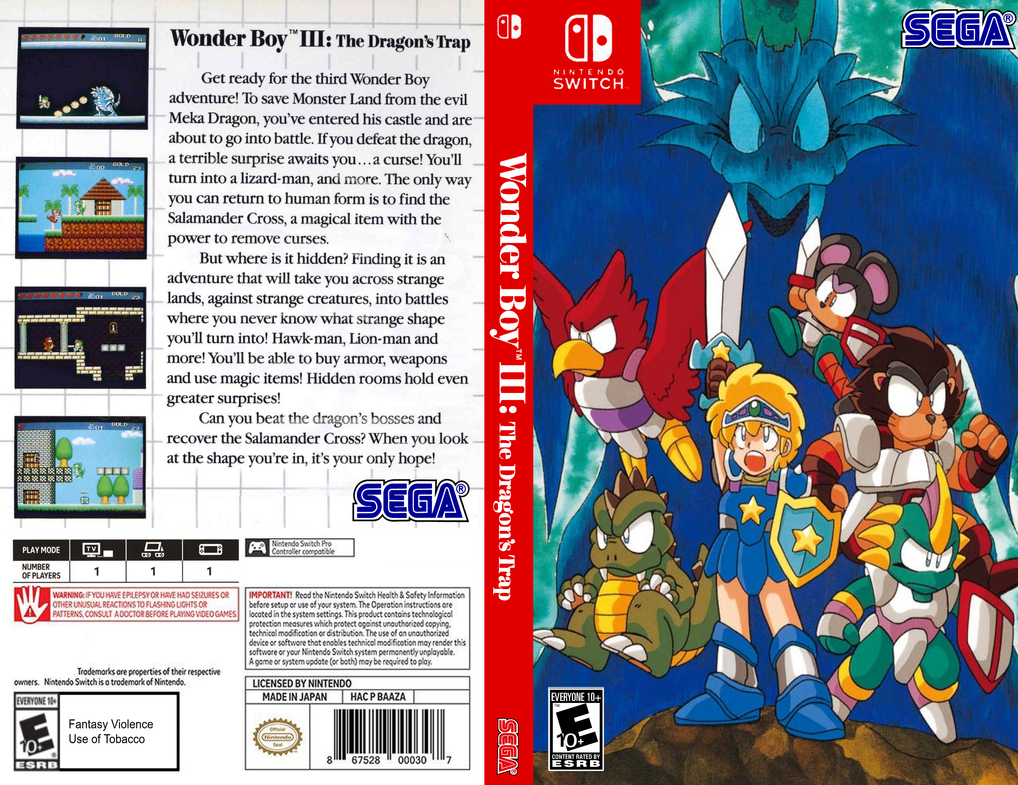 hopefully more to come XD |
|
JeffCross
Shadow of the Night
Ancient Legion  [TI0] Die monster!!!!!!
Posts: 1,365

inherit
Shadow of the Night
46
0
Aug 2, 2019 16:52:01 GMT -6
711
JeffCross
[TI0] Die monster!!!!!!
1,365
Jun 9, 2015 16:58:57 GMT -6
June 2015
jeffcross773
|
Post by JeffCross on May 21, 2017 21:19:57 GMT -6
looks like not many people are into this box art thing but I will release them here anyways 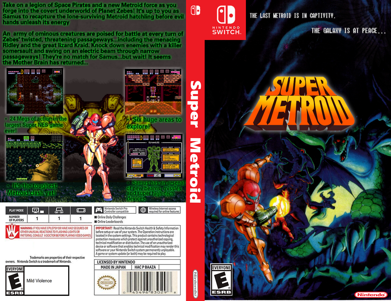 and the inside 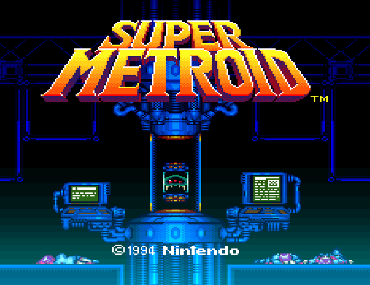 again more to come... but if you want to see all of them check out my tumbler here |
|
fatihG
Devil Forgemaster
Fifty Storms  I am the morning sun, come to vanquish this horrible night!
Posts: 313

inherit
Devil Forgemaster
1312
0
1
May 26, 2021 21:25:49 GMT -6
342
fatihG
I am the morning sun, come to vanquish this horrible night!
313
Jun 9, 2016 17:36:43 GMT -6
June 2016
fatihg
|
Post by fatihG on May 22, 2017 20:00:54 GMT -6
I like stuff like this!
back in the day I used to create 'alternative' boxart for existing games, just for giggles.
Not a big fan of the black on dark grey font colour, with the green outlines.
Gotta keep legibility in mind. I think simply changing it to a white will work allot better.
|
|
JeffCross
Shadow of the Night
Ancient Legion  [TI0] Die monster!!!!!!
Posts: 1,365

inherit
Shadow of the Night
46
0
Aug 2, 2019 16:52:01 GMT -6
711
JeffCross
[TI0] Die monster!!!!!!
1,365
Jun 9, 2015 16:58:57 GMT -6
June 2015
jeffcross773
|
Post by JeffCross on May 22, 2017 21:41:09 GMT -6
yeah, I agree the green is a bit too bright and hard to read... this next one is an early one (the early ones are the ones that have a large block of text I had no Idea what to do with lol 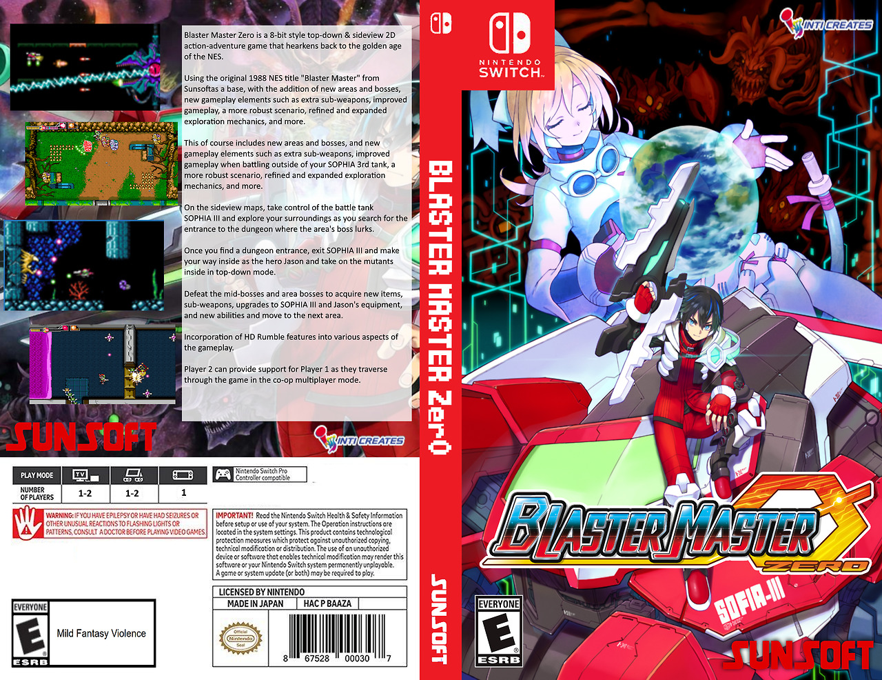 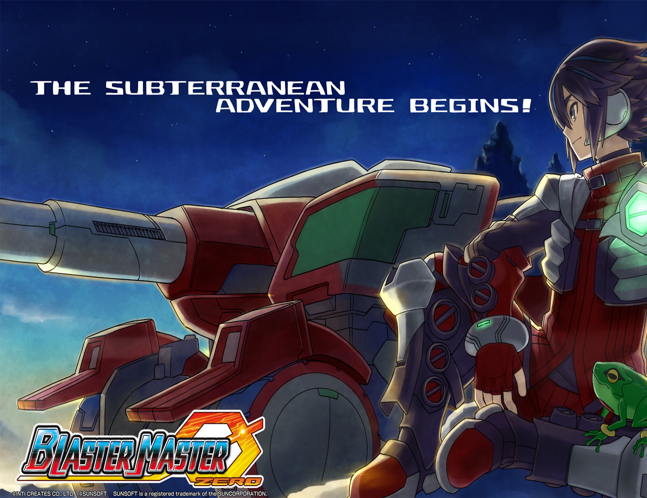 hope you enjoy this one too... |
|
Cernex
Loyal Familiar
 Still learning how things work
Posts: 188

inherit
1265
0
Dec 21, 2023 5:04:36 GMT -6
129
Cernex
Still learning how things work
188
Apr 19, 2016 11:47:07 GMT -6
April 2016
cernex
|
Post by Cernex on May 23, 2017 11:39:20 GMT -6
Not a big fan of the black on dark grey font colour, with the green outlines. Gotta keep legibility in mind. I think simply changing it to a white will work allot better. This, pretty much. That lettering was... well, "rough", to say the least. It's not a bad cover -at least I don't think so- but font... jebus in an unicycle... |
|
JeffCross
Shadow of the Night
Ancient Legion  [TI0] Die monster!!!!!!
Posts: 1,365

inherit
Shadow of the Night
46
0
Aug 2, 2019 16:52:01 GMT -6
711
JeffCross
[TI0] Die monster!!!!!!
1,365
Jun 9, 2015 16:58:57 GMT -6
June 2015
jeffcross773
|
Post by JeffCross on May 23, 2017 19:35:40 GMT -6
and the next one... Snipperclips!!! I thought this one was gonna be the easiest one to do... but it actually became the hardest lol. 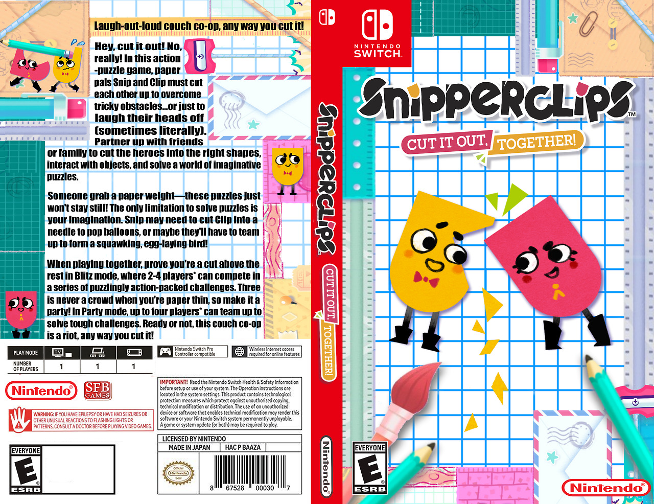 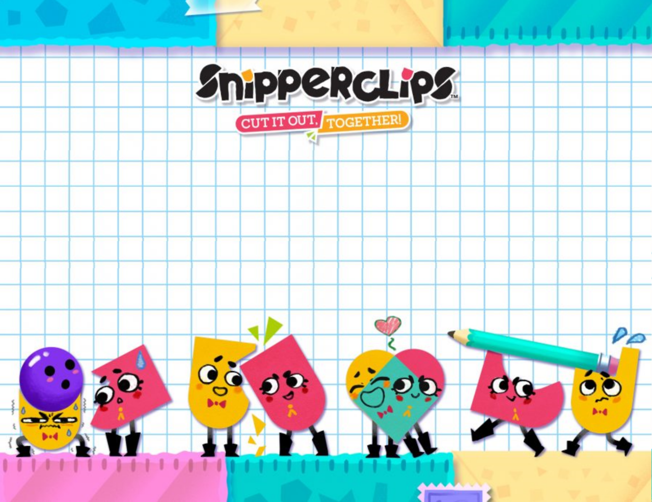 so what do you guys want to see next? (I've made box art for most of the digital games). |
|
JeffCross
Shadow of the Night
Ancient Legion  [TI0] Die monster!!!!!!
Posts: 1,365

inherit
Shadow of the Night
46
0
Aug 2, 2019 16:52:01 GMT -6
711
JeffCross
[TI0] Die monster!!!!!!
1,365
Jun 9, 2015 16:58:57 GMT -6
June 2015
jeffcross773
|
Post by JeffCross on May 23, 2017 23:23:12 GMT -6
I know it is not boxart but who would buy a golden The Legend of Zelda: Breath of the Wild cartridge? 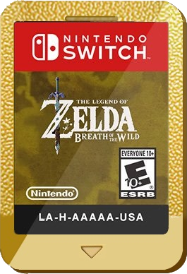 |
|
JeffCross
Shadow of the Night
Ancient Legion  [TI0] Die monster!!!!!!
Posts: 1,365

inherit
Shadow of the Night
46
0
Aug 2, 2019 16:52:01 GMT -6
711
JeffCross
[TI0] Die monster!!!!!!
1,365
Jun 9, 2015 16:58:57 GMT -6
June 2015
jeffcross773
|
Post by JeffCross on May 31, 2017 6:47:41 GMT -6
|
|
fatihG
Devil Forgemaster
Fifty Storms  I am the morning sun, come to vanquish this horrible night!
Posts: 313

inherit
Devil Forgemaster
1312
0
1
May 26, 2021 21:25:49 GMT -6
342
fatihG
I am the morning sun, come to vanquish this horrible night!
313
Jun 9, 2016 17:36:43 GMT -6
June 2016
fatihg
|
Post by fatihG on Jun 2, 2017 22:09:44 GMT -6
looks cool man, I like the Bravely Complete one. In general though i feel like the text on the front of the boxart feels cheap. Its like, trying to explain something that should be self explanatory. Or the boxart isn't good enough that it needs additional text. Either way I would avoid placing any text (other than the logo/game title of course) on the front of the box. I think you should think about composition as well. For example the Custom Robo one, the it feels like there should be more of that picture, as the character left side almost feels like it didn't fit into the frame. Almost like it got cropped too much. The StarTropics one, could just use better composition overall. For example, I would have moved the whole BG down a bit so that the logo is basically on a clear Sky BG, so it stands out easily, no background noise. The character in the bottom right almost feels like it is tucked into the corner. Would make it a bit bigger and move it in a bit so it is on the right 'rule of thirds' line. The characters jacket is also very close to the colour of the sea behind him. Either change the colour a bit so it blends in less, or change the BG a bit. Not a big fan of the photoshop filtered image for the insides either. Anyway created a quick paintover, hope you dont mind.  |
|
Cernex
Loyal Familiar
 Still learning how things work
Posts: 188

inherit
1265
0
Dec 21, 2023 5:04:36 GMT -6
129
Cernex
Still learning how things work
188
Apr 19, 2016 11:47:07 GMT -6
April 2016
cernex
|
Post by Cernex on Jun 3, 2017 3:36:19 GMT -6
Man, if Custom Robo was ever re-released, I think I would totally lose my mind.
|
|
JeffCross
Shadow of the Night
Ancient Legion  [TI0] Die monster!!!!!!
Posts: 1,365

inherit
Shadow of the Night
46
0
Aug 2, 2019 16:52:01 GMT -6
711
JeffCross
[TI0] Die monster!!!!!!
1,365
Jun 9, 2015 16:58:57 GMT -6
June 2015
jeffcross773
|
Post by JeffCross on Jun 3, 2017 15:27:10 GMT -6
Cernex yes, I would freak out too XD I loved the collecting and building aspect of the game... AND the way the joycons are built, I know nintendo could come up with an awesome new control scheme... To me, custom robo would be the most awesome old IP revival EVER XD
|
|
JeffCross
Shadow of the Night
Ancient Legion  [TI0] Die monster!!!!!!
Posts: 1,365

inherit
Shadow of the Night
46
0
Aug 2, 2019 16:52:01 GMT -6
711
JeffCross
[TI0] Die monster!!!!!!
1,365
Jun 9, 2015 16:58:57 GMT -6
June 2015
jeffcross773
|
Post by JeffCross on Jun 3, 2017 15:56:20 GMT -6
looks cool man, I like the Bravely Complete one. In general though i feel like the text on the front of the boxart feels cheap. Its like, trying to explain something that should be self explanatory. Or the boxart isn't good enough that it needs additional text. Either way I would avoid placing any text (other than the logo/game title of course) on the front of the box. I think you should think about composition as well. For example the Custom Robo one, the it feels like there should be more of that picture, as the character left side almost feels like it didn't fit into the frame. Almost like it got cropped too much. The StarTropics one, could just use better composition overall. For example, I would have moved the whole BG down a bit so that the logo is basically on a clear Sky BG, so it stands out easily, no background noise. The character in the bottom right almost feels like it is tucked into the corner. Would make it a bit bigger and move it in a bit so it is on the right 'rule of thirds' line. The characters jacket is also very close to the colour of the sea behind him. Either change the colour a bit so it blends in less, or change the BG a bit. Not a big fan of the photoshop filtered image for the insides either. Don't worry I don't mind your changes... but I do want to explain a few of the choices I made... with the Custom Robo I wanted the Gun to show... I cut a bit of it (and I was thinking of overlaying the gun over the rib of the cover for a 3d like effect... but the I tried to have as much of the robo in the pic as possible... so it was either had to cut a lot of the gun or have more of the character showing... I decided to show more of the gun and crop a bit of the character... I personally think it gives it a bit of a dynamic feel. Now with startropic you, pointing out the water is almost the same color of the jacket... yeah, I didn't notice lol thanks for that. I actually changed the hue of the character to make his skin darker (more surfer dude style) didn't notice the color similarities to the water and jacket. and with the rule of thirds thing... it does follow the rule of thirds... but in this instance, the horizon is higher. And if you notice the whole pic is balanced... I know Mike is small but that is because the main "character" in the pic is not him it is the "tropics" Mike is playing second fiddle to the island. and the filters... I didn't use any... it's just how the pic looks. I could have done the island the same way I did the inside cover but I think it would distort the background too much and as I said before the island is the main focus. But personally, I don't like Mike's pic I do feel he is tacked on and I don't like that, but something needed to be there or the top left part of the cover would feel too "big" or "crowded" I wish there were more pics of Mike but sadly there's not many... And finally, with the logo I lightened the back of the logo a bit... maybe I should have darkened it instead... I will put another one up soon... maybe... or I might just move on to the next covers... I was thinking classic Zelda boxart what do you think? |
|
fatihG
Devil Forgemaster
Fifty Storms  I am the morning sun, come to vanquish this horrible night!
Posts: 313

inherit
Devil Forgemaster
1312
0
1
May 26, 2021 21:25:49 GMT -6
342
fatihG
I am the morning sun, come to vanquish this horrible night!
313
Jun 9, 2016 17:36:43 GMT -6
June 2016
fatihg
|
Post by fatihG on Jun 3, 2017 17:42:03 GMT -6
Yeah, looking at he images i could feel your intentions. I did a quick google yesterday on the CustomRobo image, the original image that I could find was a but cropped on the right side as well, so I can understand that it was not the best image you had. If however you did crop it a bit more, I feel like it would have worked a bit better if you simply resized the image a bit so more of the character would show. With StarTropics, I see what you mean. In a perfect would you would have the beach from a top down perspective, with the character looking up at the camera. That way the island would still be the main focus, and the character a detail. But you have to work with the source images you got. Kinda like this; d2v9y0dukr6mq2.cloudfront.net/video/thumbnail/7wfbAwq/aerial-drone-view-young-african-american-asian-chinese-girls-in-swimwear-beach_416tidqsl__S0000.jpgHowever the camera would be over the sea, looking at the island. And the characters facing the camera. Cant go wrong with a classic Zelda on a Nintendo system for a fake boxart. =P |
|
JeffCross
Shadow of the Night
Ancient Legion  [TI0] Die monster!!!!!!
Posts: 1,365

inherit
Shadow of the Night
46
0
Aug 2, 2019 16:52:01 GMT -6
711
JeffCross
[TI0] Die monster!!!!!!
1,365
Jun 9, 2015 16:58:57 GMT -6
June 2015
jeffcross773
|
Post by JeffCross on Jun 4, 2017 6:40:55 GMT -6
hope you guys like this XD... Oh and the reason my covers look "old" is because I try to only use the "official" artwork from the perspective games. Oh and bonus points for finding Ganon in the front cover. 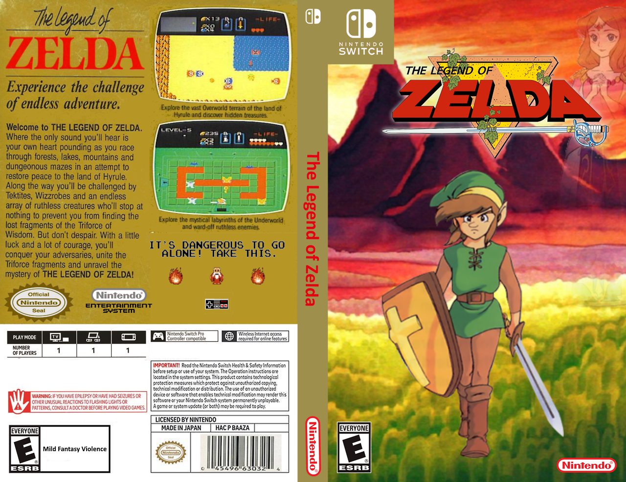 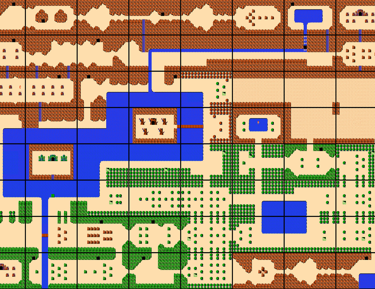 hope you guys enjoy this... |
|
JeffCross
Shadow of the Night
Ancient Legion  [TI0] Die monster!!!!!!
Posts: 1,365

inherit
Shadow of the Night
46
0
Aug 2, 2019 16:52:01 GMT -6
711
JeffCross
[TI0] Die monster!!!!!!
1,365
Jun 9, 2015 16:58:57 GMT -6
June 2015
jeffcross773
|
Post by JeffCross on Jun 5, 2017 14:33:25 GMT -6
this is a request... can anyone translate this for me? trying to do a box for gunman's proof just need the back cover translated... thank you if anyone does it  |
|
fatihG
Devil Forgemaster
Fifty Storms  I am the morning sun, come to vanquish this horrible night!
Posts: 313

inherit
Devil Forgemaster
1312
0
1
May 26, 2021 21:25:49 GMT -6
342
fatihG
I am the morning sun, come to vanquish this horrible night!
313
Jun 9, 2016 17:36:43 GMT -6
June 2016
fatihg
|
Post by fatihG on Jun 9, 2017 19:09:46 GMT -6
no idea how to help.
There is an app on my phone that scans images to convert them to a pdf/text.
tried it with the Japanese language option, but it seems to always prioritize the English detection over anything else.
So all the things I tried ended up in a bunch of random characters.
|
|
JeffCross
Shadow of the Night
Ancient Legion  [TI0] Die monster!!!!!!
Posts: 1,365

inherit
Shadow of the Night
46
0
Aug 2, 2019 16:52:01 GMT -6
711
JeffCross
[TI0] Die monster!!!!!!
1,365
Jun 9, 2015 16:58:57 GMT -6
June 2015
jeffcross773
|
Post by JeffCross on Jun 10, 2017 20:03:03 GMT -6
no idea how to help. There is an app on my phone that scans images to convert them to a pdf/text. tried it with the Japanese language option, but it seems to always prioritize the English detection over anything else. So all the things I tried ended up in a bunch of random characters. Thanks for trying  your awesome for doing that XD |
|